" height="136px" id="PfaV7hBGi" transform="translate(119 2)" width="40px"/><path d="M 39.868 162.364 L 0 122.39 L 0 39.974 L 39.868 0 Z M 78.938 97.221 L 119 97.221 L 119 138 L 67.562 190 L 40.359 162.712 L 78.938 124.013 Z" fill="rgb(0, 0, 0)" height="189.99999947846123px" id="rWSc6CRIY" width="119px"/></g></svg>)
AQR
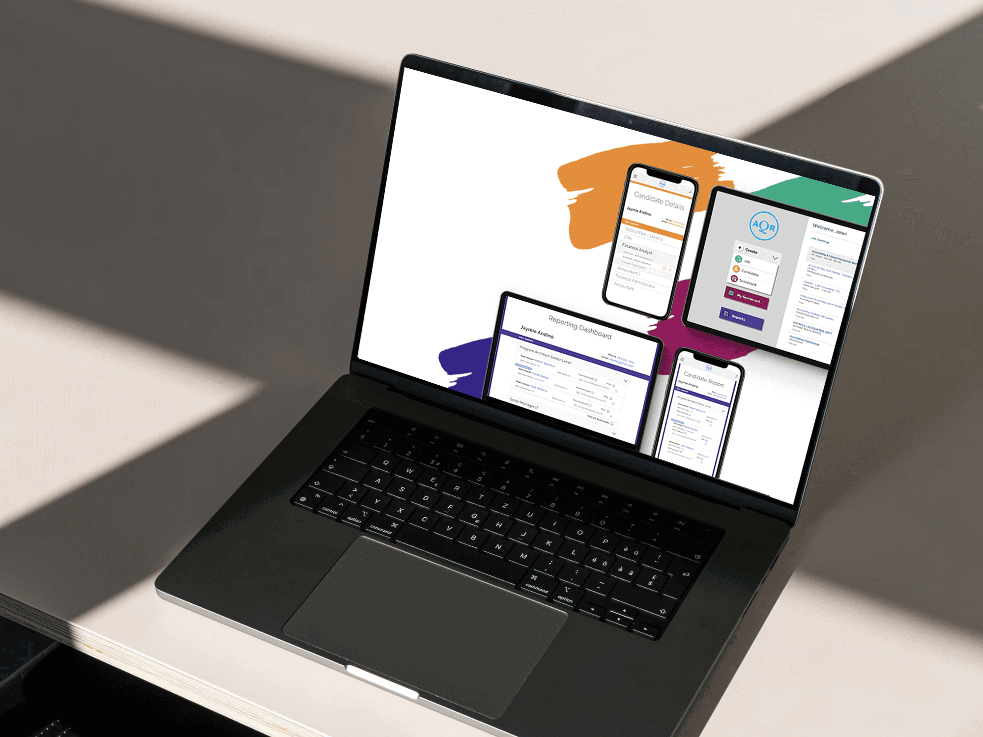
Talent Acquisition Software
Client
AQR
Platform
Adobe CC
Role
Hranush Bentley
Focus
UX Design, UI Design, Branding,
Streamlining AQR Talent Acquisition Workflow
Reducing Clicks, Cognitive Load, and Time-to-Hire in an HR Software Platform
Introduction
AQR is an enterprise Human Resources platform used to manage the end-to-end Talent Acquisition lifecycle, including requisition creation, candidate review, interview scheduling, and hiring decisions. Recruiters reported that critical tasks required excessive navigation across multiple screens, contributing to slower hiring cycles and frustration among HR teams.
My Role: Lead UX/UI Designer
Project Duration: 12 weeks
Team: Product Owner, HR SMEs, UX Researcher, Engineering Lead
Tools: Figma, FigJam, Jira, Miro, Google Analytics, Optimal Workshop
Goal
Restructure navigation and optimize the Talent Acquisition workflow in order to:
Reduce the number of clicks to complete core tasks
Improve recruiter efficiency and task completion speed
Create a more intuitive, modern, centralized workflow
Increase system adoption and overall talent pipeline velocity
The Problem
Recruiters relied heavily on AQR for daily hiring operations, yet key tasks were:
Spread across 7+ navigation pathways
Hidden behind inconsistent labels and duplicated menu items
Requiring up to 22 clicks to complete a standard candidate evaluation
Reported to cause frequent errors and incomplete candidate updates
As one recruiter put it:
“I spend more time clicking through screens than actually evaluating the candidate.”
The UX challenge: Simplify the path to the core actions that move hiring forward.
Research Approach
Methods
Research Method | Purpose |
|---|---|
Stakeholder & SME Interviews | Understand hiring workflows and bottlenecks |
Recruiter Task Observations | Document actual vs. intended behavior |
Current Sitemap Audit | Identify redundancy, confusing IA, and click depth |
Clickstream Data Analysis | Determine most frequent interaction patterns |
Competitive Benchmarking | Review UX patterns from Workday, Lever, Greenhouse |
Key Insights
From 14 interviews and task observations across 3 recruiting teams:
Recruiters frequently switched between requisition → candidate → calendar screens
Candidates with similar names made search and filtering error-prone
Over 60% of required fields were not needed at early review stages
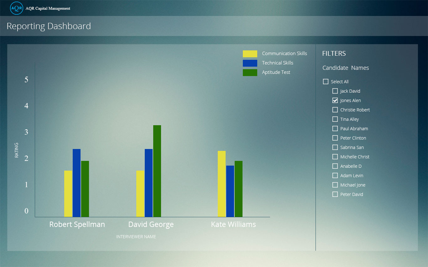
Hiring managers struggled to find interview feedback history
Clickstream showed repeated backtracking due to unclear action pathways

Sitemap Analysis
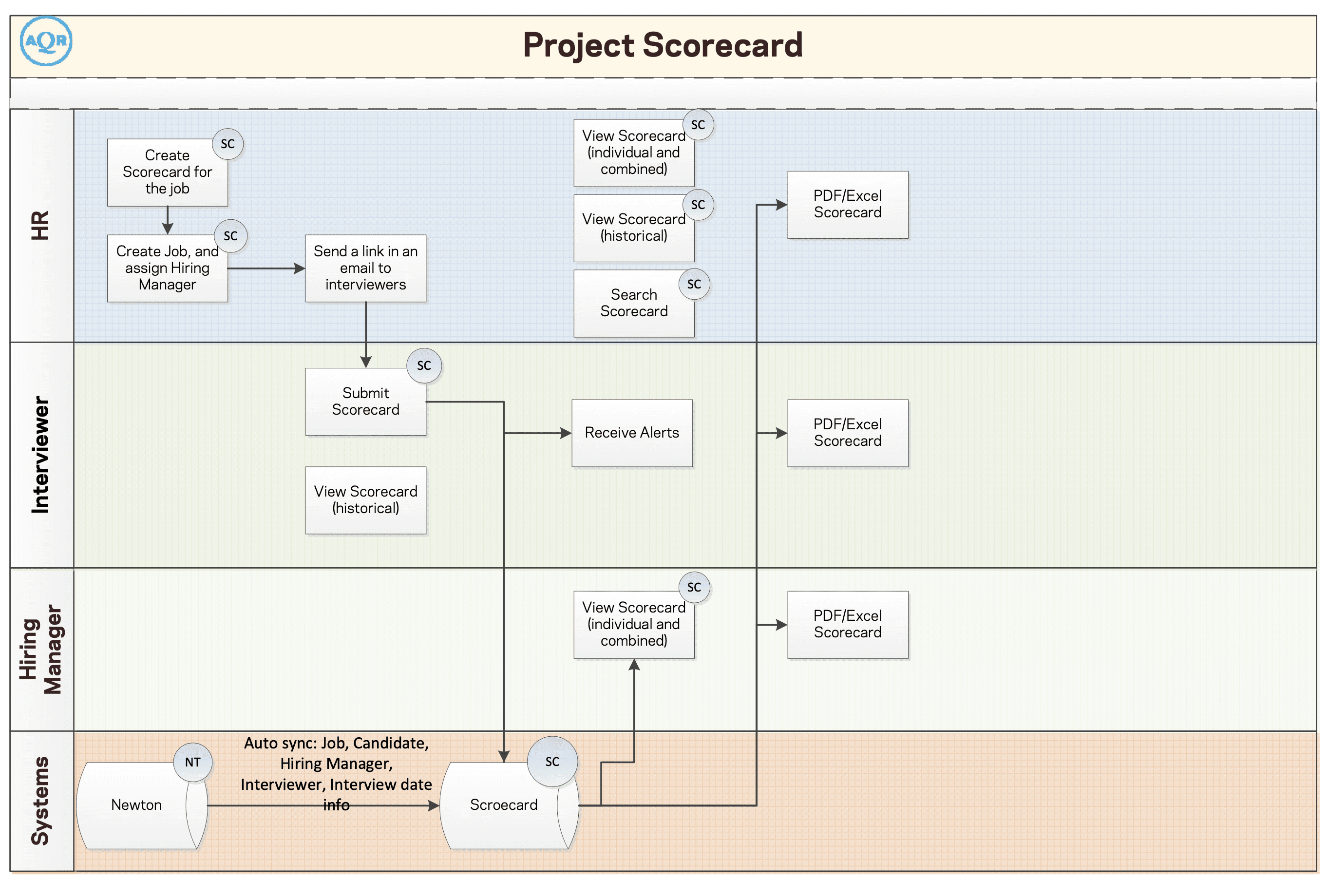
Before — Issues Identified
Deep navigation (up to 5 levels)
Redundant menu items: Jobs / Requisitions / Open Roles — all partly overlapped
Candidate data spread across multiple subpages
No persistent “context” about candidate or job while navigating
After — Optimized Information Architecture
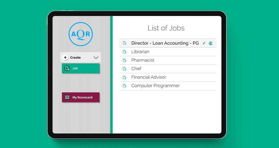
Primary Navigation Reduced from 9 to 5 items:
Dashboard
Requisitions
Candidates
Interviews
Reports
Contextual quick actions added:
“Evaluate Candidate” (single location)
“Schedule Interview”
“Send Decision to HRIS”
Design Improvements
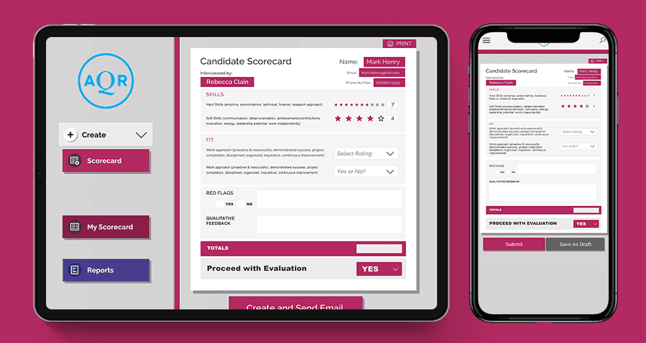
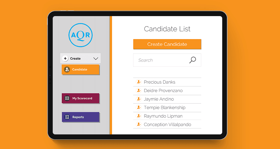
1. Introduced a Unified Candidate Profile Panel
Previously: 4–6 subpages
Now: One expandable context pane showing:
Resume & attachments
Evaluation notes
Hiring manager feedback
Interview status & availability
Decision actions
Result: ~40% fewer page transitions
2. Created a Guided Hiring Flow
Three key steps surfaced inline:
Review Resume
Add Evaluation
Move to Stage (Reject / Interview / Offer)
Reduced clicks from 22 → 8 for core actions.
3. Added Quick Filters & Smart Search
Keyword, skills, and experience tagging
Auto-dedupe for similar candidate names
Result: Less search time + far fewer candidate selection mistakes.
Usability Results
Measurement | Before | After |
|---|---|---|
Avg clicks to complete evaluation | 22 | 8 |
Avg time spent per candidate | 11 min | 5.5 min |
Navigation errors during testing | 37% | 8% |
Recruiter satisfaction (SUS) | 62 | 87 |
Recruiter feedback highlight:
“This flow lets me evaluate twice as many candidates in the same time. Game changer.”
Impact & Next Steps
Business Outcomes
✔ Faster hiring cycles and reduced recruiter workload
✔ Improved hiring manager collaboration
✔ Higher-quality candidate evaluation due to better data visibility
✔ Scalable IA foundation for future HR modules
Future Enhancements
Mobile-first flows for recruiting on-the-go
Automated skill extraction via AI
Integrations with LinkedIn and labor market analytics
Machine-learning candidate ranking
Conclusion
This project demonstrated how a data-driven UX approach and a streamlined information architecture can directly improve hiring velocity and HR team effectiveness. By reducing clicks and simplifying workflow paths, AQR now better supports the critical work of finding and hiring talent—faster, more accurately, and with less cognitive strain.