" height="136px" id="PfaV7hBGi" transform="translate(119 2)" width="40px"/><path d="M 39.868 162.364 L 0 122.39 L 0 39.974 L 39.868 0 Z M 78.938 97.221 L 119 97.221 L 119 138 L 67.562 190 L 40.359 162.712 L 78.938 124.013 Z" fill="rgb(0, 0, 0)" height="189.99999947846123px" id="rWSc6CRIY" width="119px"/></g></svg>)
VCA
Inventory & Procurement Software
Client
VCA
Platform
Adobe CC, Sketch
Role
Ux Designer
Focus
UX Design, UX Research
VCA Admin Activity Dashboard
UX Case Study: Streamlining Inventory and Customer Insights for Store Managers
Overview
VCA store managers needed a more efficient way to access essential inventory and customer information. Their daily responsibilities depend on being able to quickly confirm stock levels, review order history, and understand purchasing trends. However, the existing experience required managers to navigate across multiple screens and systems, increasing administrative time and contributing to ordering delays.
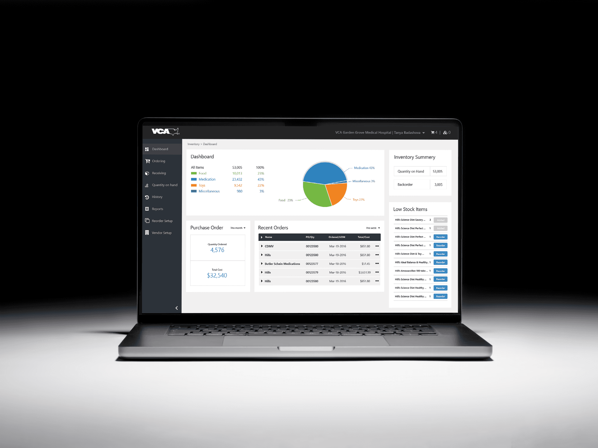
I was brought on to redesign this workflow and create a centralized administrative activity dashboard. The goal was to reduce the number of clicks required to perform core tasks, improve visibility into low-stock products, and give store owners a reliable, data-driven way to manage inventory.
My role included UX research, stakeholder alignment, information architecture, interaction design, and high-fidelity UI prototyping.
The Challenge
During stakeholder interviews and discovery workshops, I heard a consistent theme: store managers were overwhelmed by fragmented data. Some of the comments that stood out included, “I can’t find what I need when I need it,” and “I often reorder too late because I didn’t realize we were running low.” These conversations made it clear that the current structure created friction in every part of their workflow.
Core challenges identified:
Too many steps to access customer and order information
No clear visibility into low-stock items or reorder urgency
Difficulty planning and scheduling future orders
Navigation patterns that required memorization instead of clarity
Multiple sources of truth and manual reconciliation of data
One of the biggest wins in these conversations was uncovering a gap that had not been recognized internally: store managers were creating their own spreadsheets to track product quantities because they didn’t trust the system to provide information quickly enough. This insight validated the need for a dashboard that would present prioritized, real-time data.
Research Summary
To understand the problem space, I led a series of research activities:
Contextual interviews with store owners and support staff
Task analysis to map current workflows step by step
Comparative analysis of internal tools being used in parallel
Workshop sessions to test early assumptions and generate ideas
Prototype-based validation sessions with prospective users
During research, several important discoveries emerged:
Order history was accessed far more often than expected. Managers said they referenced it daily, sometimes multiple times, to track vendor performance and confirm pricing.
Low-stock awareness needed to be proactive, not reactive. Managers wanted alerts and thresholds tailored to store size and product turnover.
Quick ordering was more important than expanding advanced features. Reliability and speed mattered more than additional customization options.
Navigation had to feel predictable, not exploratory. Managers valued a straightforward structure that didn’t require searching.
A defining research win was when a senior store manager reviewed an early navigation model and said, “If this is what the final product looks like, it will save me at least an hour every day.” This comment offered strong validation that we were on the right track.

The Solution
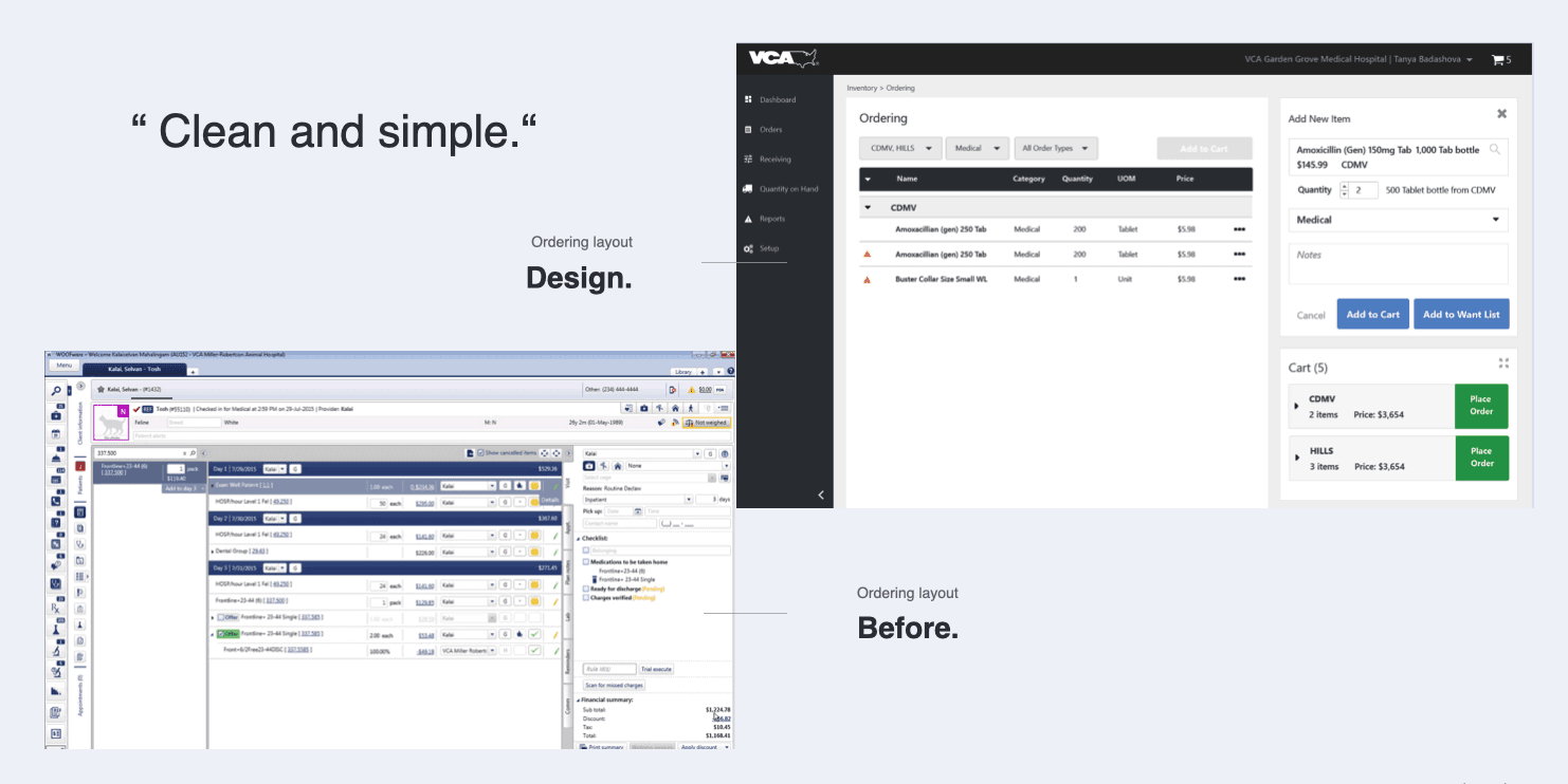
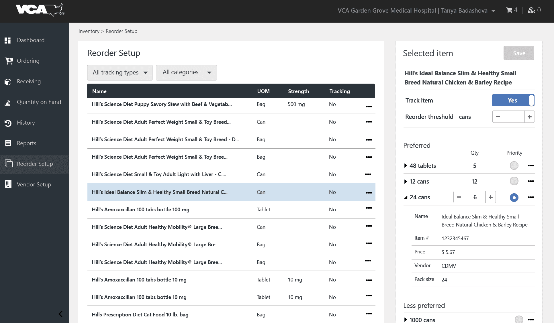
I designed a dashboard experience that reorganized inventory management around clarity and efficiency. The solution introduced:
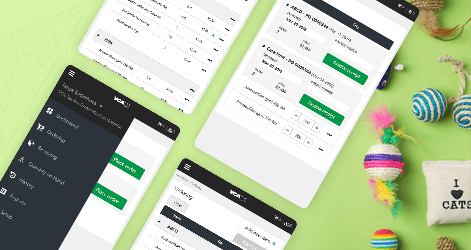
A simplified left-hand navigation that grouped related actions into logical sections
A consolidated view showing low-stock alerts, order history, and upcoming scheduled orders
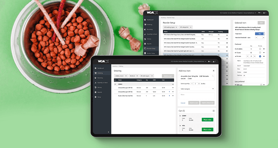
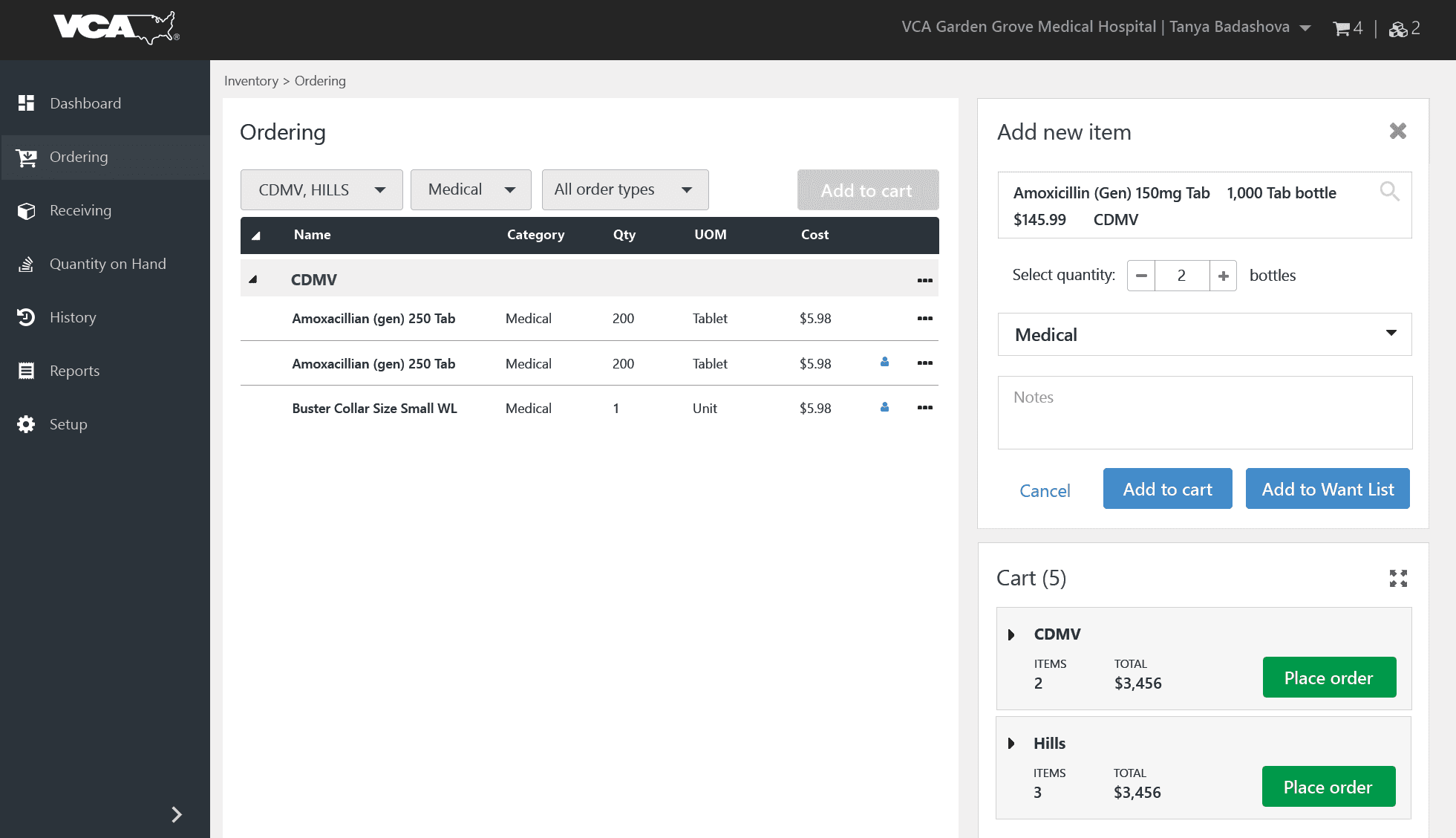
Quick actions to reorder products or create new orders without leaving the screen
A streamlined order history table with sorting, filtering, and searchable details
A scheduling feature letting managers plan recurrent or seasonal orders in a few steps
User feedback directly informed the layout. During testing, participants consistently requested fewer pages and more inline actions. As a result, the dashboard evolved to reduce multi-step transitions and make commonly used workflows accessible within one click.
Results and Impact
After several design and feedback cycles, store managers reported that the redesigned flow changed how quickly and confidently they could manage inventory. The final prototype demonstrated that:
Past orders could be reached in one click from the dashboard
Low-stock concerns were surfaced before they became urgent
Future orders could be scheduled without external spreadsheets or reminders
Data was organized in a way that mirrored store owners’ mental models
Administrative tasks required fewer screens and less manual searching
Several participants noted that the new structure felt “built for the real world,” which I believe is one of the strongest compliments a UX practitioner can receive.
One store manager remarked, “I finally feel like the system understands how I work, instead of making me work around it.” This sentiment captured the core win of the redesign: it restored trust in the system and gave store owners time back in their day.
Personal Reflections
This project reaffirmed my belief that listening deeply is a superpower in UX. The most important breakthroughs came not from data alone but from moments in interviews when someone said, “Let me show you what I actually do.” Watching users navigate workarounds inspired design choices that would never have emerged from assumptions.
It also reinforced that efficiency is not about designing more features. It is about designing the right access to the right information at the right time.
Next Steps
If the project proceeds into full product development, recommended enhancements include:
Mobile/handheld version for in-store inventory checks
Automated reorder recommendations based on usage patterns
Vendor performance insights within order history
Export and reporting tools for multi-store owners
Conclusion
The VCA Admin Activity Dashboard improved the speed and clarity of decision-making for store owners by reducing friction in daily operations. Through research-driven design, we eliminated unnecessary clicks, centralized core tasks, and provided a clear path to managing orders and inventory with confidence.
The result is a more dependable system, a more efficient workflow, and a better experience for the people who keep stores running.