" height="136px" id="PfaV7hBGi" transform="translate(119 2)" width="40px"/><path d="M 39.868 162.364 L 0 122.39 L 0 39.974 L 39.868 0 Z M 78.938 97.221 L 119 97.221 L 119 138 L 67.562 190 L 40.359 162.712 L 78.938 124.013 Z" fill="rgb(0, 0, 0)" height="189.99999947846123px" id="rWSc6CRIY" width="119px"/></g></svg>)
Jun 19, 2025
/
3 min read
The Five Elements of Interaction Design: Motion, Space, Texture, Time, Sound
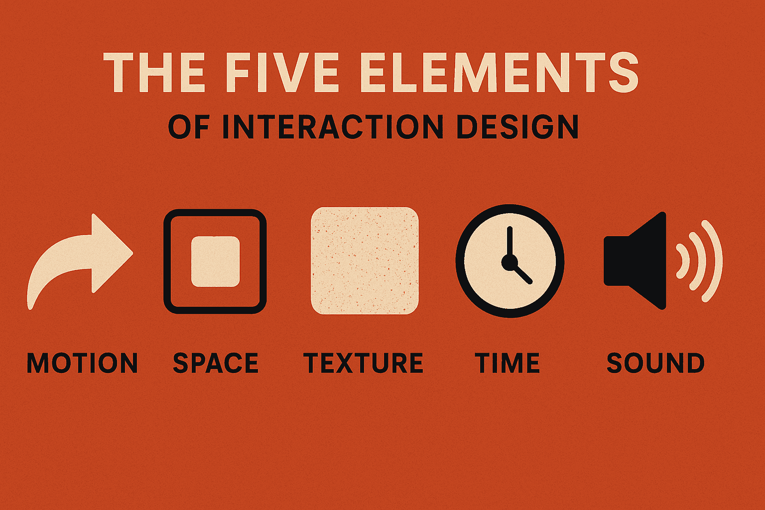
This article explores the five essential elements of interaction design: Motion, Space, Texture, Time, and Sound and how they shape digital experiences beyond pixels and wireframes. Each element is broken down with context, techniques, and pro tips, showing how they work together to transform apps and interfaces into performances that feel alive. Whether you’re a UX designer, product thinker, or creative technologist, this guide reframes interaction design as choreography, rhythm, and storytelling so your designs don’t just function, they resonate.
Share this article
Designers love to talk about wireframes, flows, and usability tests but if you zoom out, all digital experiences boil down to how they feel to use.
And feelings aren’t born from pixels alone. They’re born from rhythm, pace, touch, and sound—the same things that make a live performance unforgettable. That’s why the five elements of interaction design Motion, Space, Texture, Time, and Sound are so powerful. They give digital products the qualities of theater, dance, and music.
Here’s how each one shows up in real-world design and how to use it like a pro.
1. Motion: The Choreographer
Imagine scrolling through an app where everything just snaps on and off like a bad PowerPoint presentation. Awkward, right? Motion fixes that. It’s the language of change the way an interface explains what just happened and what’s about to happen.
Motion makes the invisible visible. A swipe reveals hidden content. A shake cancels an action. A button ripple says, “Yes, I heard your tap.” Done right, motion isn’t decoration it’s conversation.
Patterns & Techniques:
A button doesn’t just “submit”, it bounces with relief.
A card doesn’t just open, it glides into focus like it was always meant to.
A progress bar doesn’t just fill, it breathes in a rhythm that calms impatience.
Pro Tip: Design motion with a purpose. Ask: Does this animation teach, reassure, or delight? If not, cut it.
2. Space: The Stage
Space is more than margins and padding, it’s the theater where your interaction drama plays out. Humans read space instinctively: we group things that are close, separate things that are apart, and understand layers without even thinking about them.
Cluttered design suffocates the user. Generous space, on the other hand, builds trust and confidence. Think of Apple’s product pages, lots of whitespace, letting each element breathe like it’s on a pedestal.
Patterns & Techniques:
Proximity says “these belong together.”
Layers and depth whisper “this is foreground, that’s background.”
Whitespace isn’t empty, it’s oxygen for attention.
Pro Tip: Don’t think of space as “blank.” Think of it as active guidance. Every pixel of space you give something is telling the user how important it is.
3. Texture: The Grip
Flat pixels don’t have “feel.” That’s where texture comes in, it makes digital interactions tactile, expressive, and alive.
Texture can be literal (like shadows and gradients that mimic depth) or sensory (like a haptic buzz that says “action complete”). It’s also cultural, think of how Google’s clean material design feels efficient, while video games like Fortnite layer on texture for chaos and excitement. Texture tells your users not just what to do, but how your product feels to use.
Patterns & Techniques:
A soft shadow makes a button touchable.
A vibration on tap says “yep, you nailed it.”
Even the density of UI (minimalist vs. gritty detail) changes the vibe of an app.
Pro Tip: Match texture to brand personality. A banking app should feel crisp and solid. A meditation app should feel soft and airy. A game? Wild and immersive.
4. Time: The Rhythm
Every interaction happens across time. Users are constantly waiting, moving, or repeating actions and how you manage those beats can make or break the flow.
Time in design isn’t about clocks it’s about rhythm. Are animations too slow? Do users get left hanging with nothing but a spinner? Or does the app anticipate their pace and keep them in sync? Think of time as the conductor keeping the orchestra together.
Patterns & Techniques:
Loading states that dance instead of stall.
Subtle delays that give users a beat to anticipate what’s coming.
Session memory that picks up where users left off.
Pro Tip: Test your product at real-life speeds. Watch how users actually move not how you wish they would and design your timing to match their tempo.
5. Sound: The Voice
Sound is the secret spice of interaction design. It’s immediate, emotional, and impossible to ignore. A single “ding” can either comfort or annoy. That’s why sound is so powerful, it hits faster than visuals.
Most apps play it safe and go silent. But the ones that embrace sound strategically create moments users remember. Think of Slack’s cheery “knock brush” notification—it’s not just a sound, it’s part of the brand.
Patterns & Techniques:
A soft “ding” makes a notification friendly instead of alarming.
A tactile click in headphones makes typing on glass feel real.
A playful sound effect can make a kid (or bored adult) tap the same button five times just for fun.
Pro Tip: Treat sound like seasoning: sprinkle, don’t dump. Always give users control to mute, volume, or off.
The Five Elements, Together
Here’s where it all clicks: none of these elements live alone.
A swipe (motion) pulls a card forward (space), reinforced with a shadow (texture), timed with a subtle delay (time), finished with a soft click (sound). That’s not just an interaction, it’s a performance.
The best products don’t just look nice. They feel choreographed. They guide, reassure, and entertain. When you design with Motion, Space, Texture, Time, and Sound in harmony, you’re not just making apps. You’re designing experiences that feel alive, like they were built for humans, not machines.
Written by Hranush Bentley
Read more