" height="136px" id="PfaV7hBGi" transform="translate(119 2)" width="40px"/><path d="M 39.868 162.364 L 0 122.39 L 0 39.974 L 39.868 0 Z M 78.938 97.221 L 119 97.221 L 119 138 L 67.562 190 L 40.359 162.712 L 78.938 124.013 Z" fill="rgb(0, 0, 0)" height="189.99999947846123px" id="rWSc6CRIY" width="119px"/></g></svg>)
NIBS
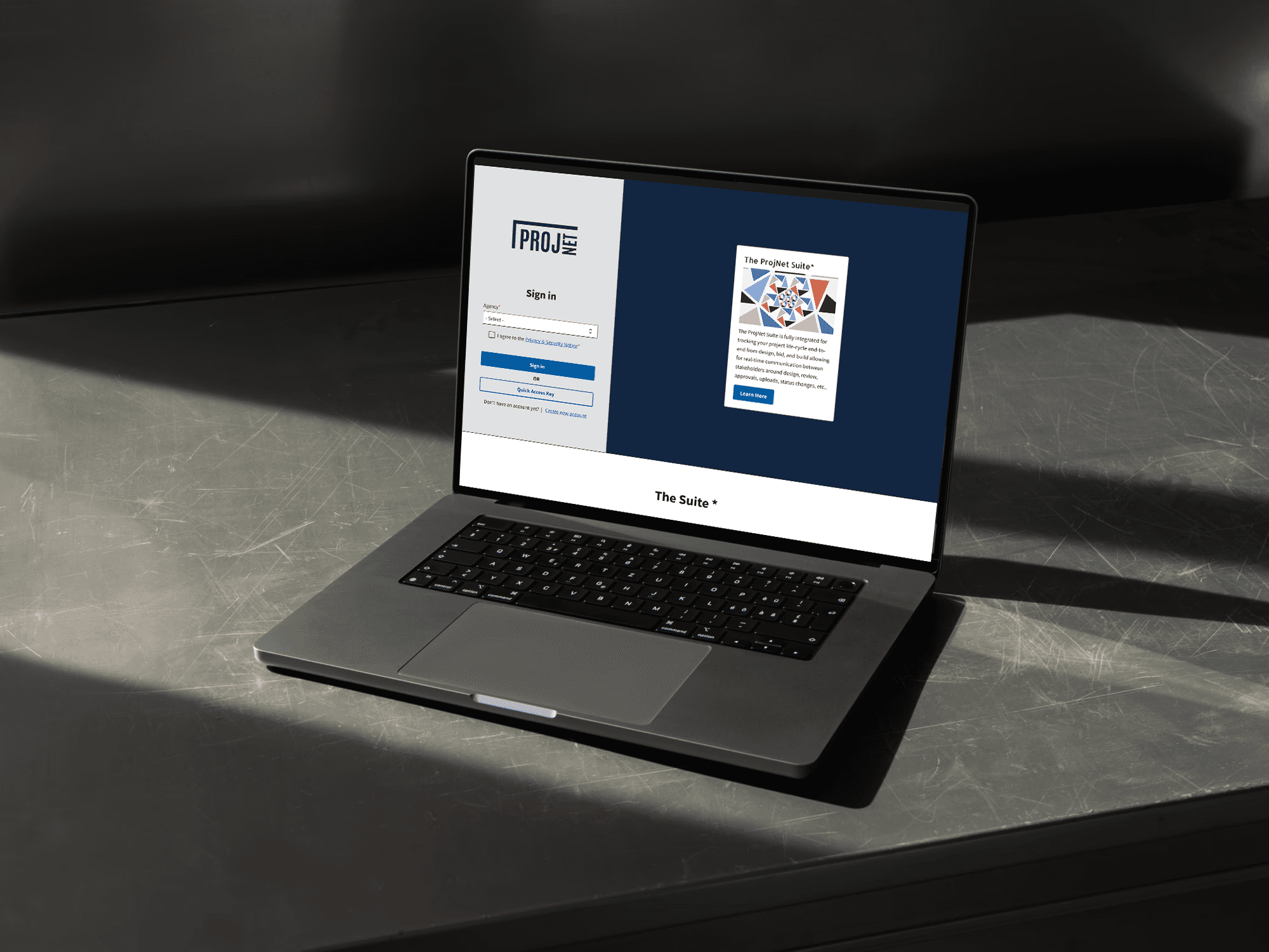
ProjNet - National Institute of Building Sciences
Client
National Institute of Building and Sciences NIBS
Platform
Figma
Role
Lead UX Designer
Focus
UX Research, Accessibility, Design Systems, Branding
Overview
ProjNet is a secure, web-based platform used by multiple federal agencies to manage construction submittals, RFIs, and design reviews. Over time, the system became outdated, its workflows fragmented, its interface inconsistent, and several key features had stopped functioning as intended.
My role as Lead UX Designer was to modernize the platform’s user experience, enhance accessibility, and establish a design system that could scale across future modules.

The Challenge
How do you transform a legacy government platform used daily by contractors, engineers, and reviewers without disrupting mission-critical workflows?
Our goals were clear:
Simplify complex, technical workflows
Improve usability and accessibility (WCAG + ADA compliance)
Create a scalable, modular design system
Build user trust through collaboration and transparency
Approach
The modernization strategy was grounded in human-centered design. We adopted the U.S. Web Design System (USWDS) as the visual and accessibility foundation. Through research, workshops, iterative design, and continuous stakeholder engagement, I designed a new UX framework on a modern platform that would support scalability and long-term maintenance.
Results Preview
The final design delivered an accessible, visually cohesive platform that reduced user confusion, improved navigation, and streamlined workflows. The project laid the groundwork for future modules and a fully integrated design system.
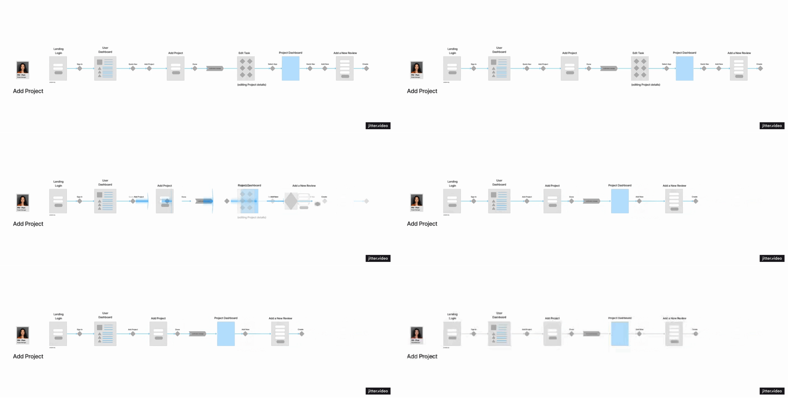
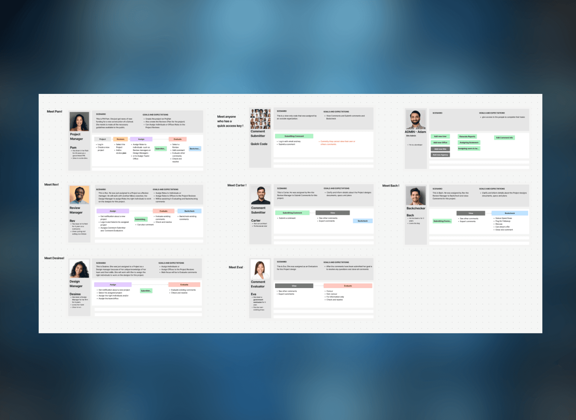
Optimizing Sitemaps
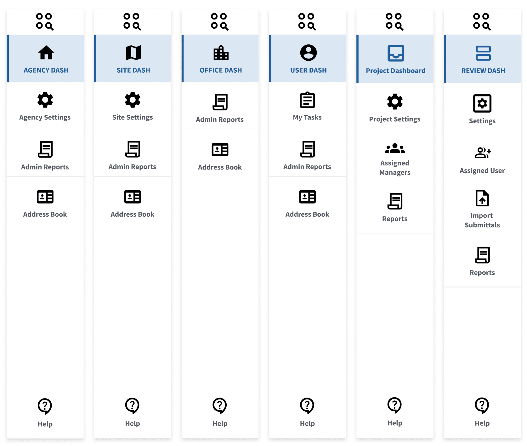
Optimizing the ProjNet sitemap was key to reducing unnecessary clicks and simplifying user workflows. By mapping every page and pathway, I identified redundancies and confusing routes that slowed users down. Restructuring the sitemap into a cleaner, role-based hierarchy consolidated functions, removed outdated steps, and shortened key task flows. The result was a more efficient, intuitive experience and a clearer blueprint for both design and development.
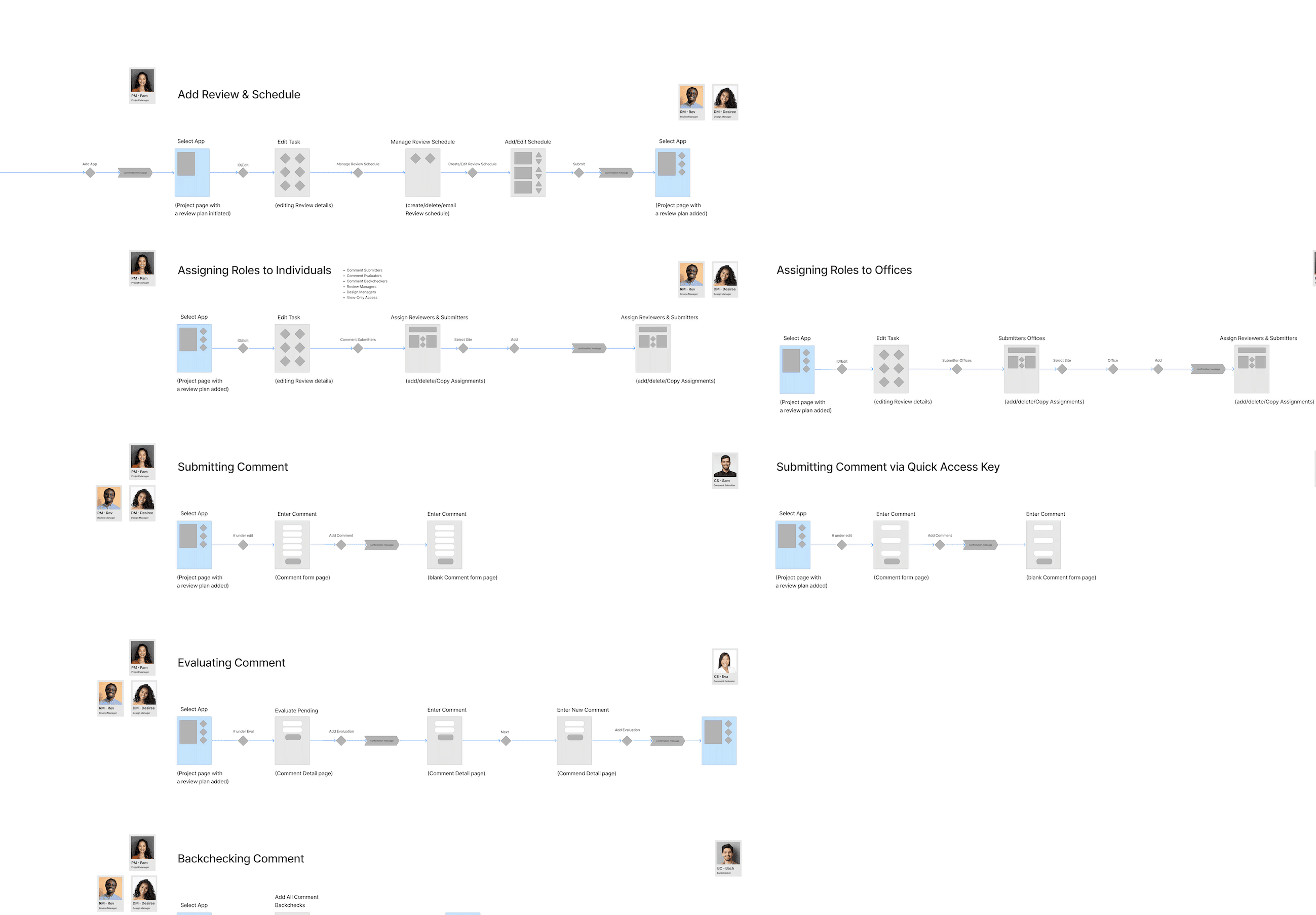

The Process
The design process followed a structured, iterative approach to ensure user involvement and continuous validation.
Phase 1: Discovery and Alignment
We began with stakeholder workshops and technical audits to identify pain points and establish priorities. A comprehensive sitemap was developed to visualize every page, feature, and workflow. This provided clarity across teams and exposed redundant or outdated functionality that was slowing the system.
Phase 2: Framework and Standards
Leveraging the USWDS, I developed a scalable design library that unified visual elements, typography, and accessibility components. This ensured that all modules adhered to the same standards, reducing inconsistencies and speeding up developer handoff.
Phase 3: Iterative Collaboration
Each sprint included four design review cycles to maintain transparency and alignment:
Internal reviews for UX consistency
Client reviews for strategic validation
User workshops for real-world feedback
Developer reviews for technical feasibility
This rhythm helped maintain momentum and minimized rework across disciplines.
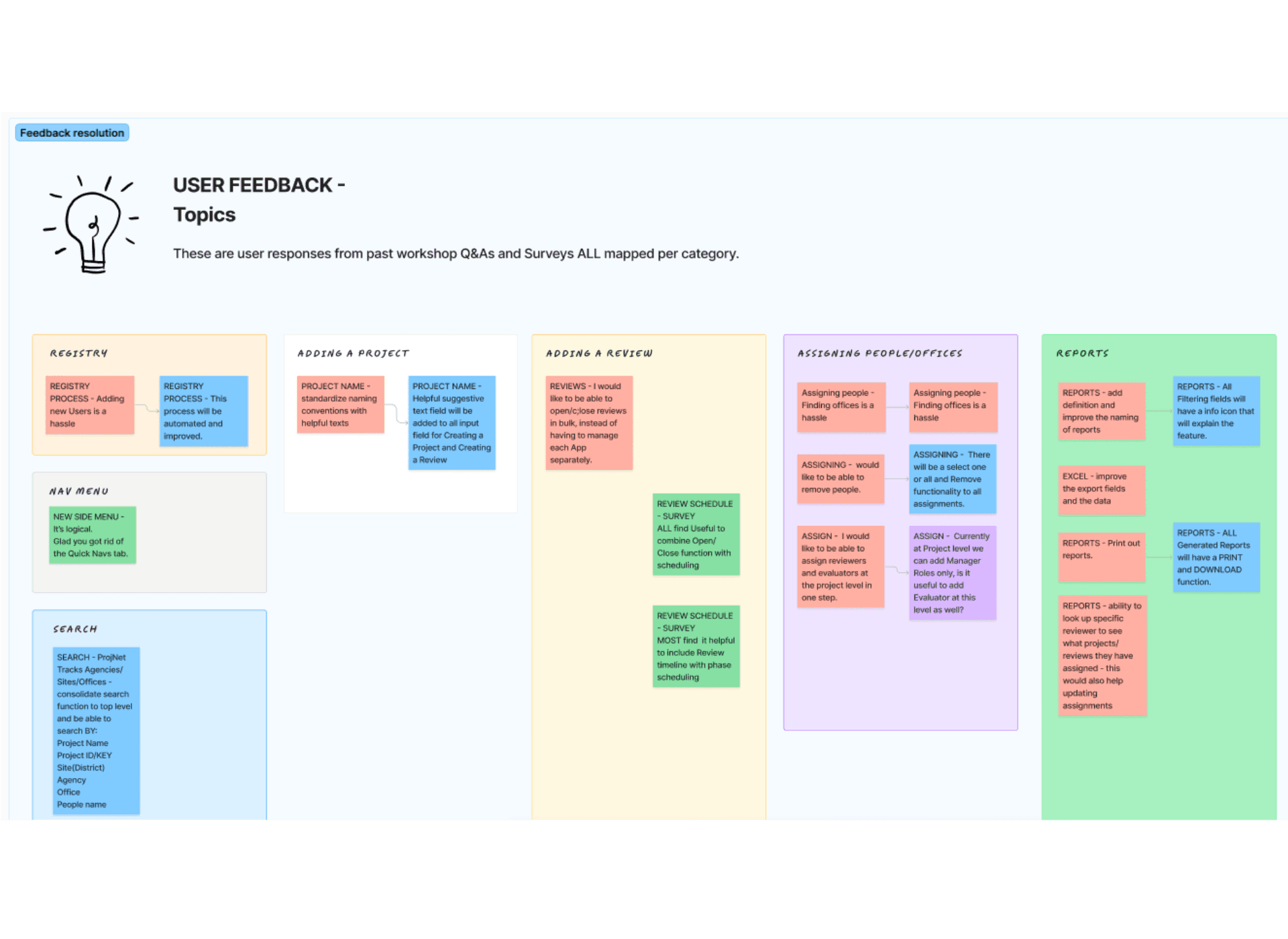
The Research
Our research combined stakeholder interviews, usability analysis, and task observation to uncover inefficiencies in the current system.
Objectives
Understand user workflows and daily challenges
Identify outdated or redundant features
Define accessibility and compliance gaps

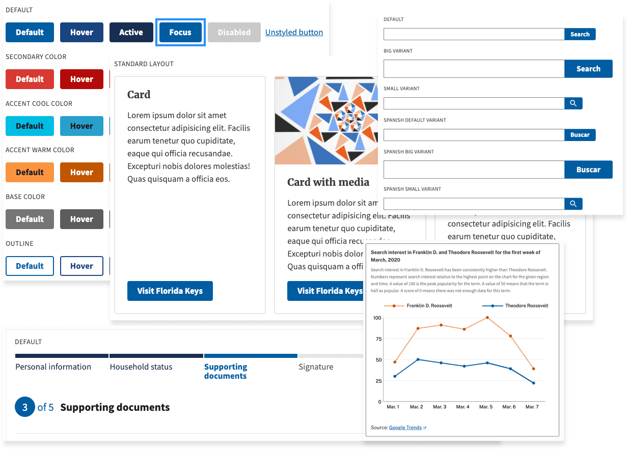
ProjNet’s New Visual Voice
Revamping the ProjNet branding was an essential part of modernizing the platform. I standardized the logo, color palette, and font family to create a cohesive visual identity that felt both contemporary and trustworthy. By unifying these core brand elements, we eliminated inconsistencies across modules and touchpoints, strengthened user confidence, and established a clear foundation for future design work. This updated branding also aligned with USWDS principles, ensuring accessibility while giving the platform a polished, professional presence.
Methodologies
Stakeholder interviews to gather business goals and constraints
Contextual inquiry with HelpDesk operators to observe real user struggles
Feature inventory and task analysis to map frequency and priority of use
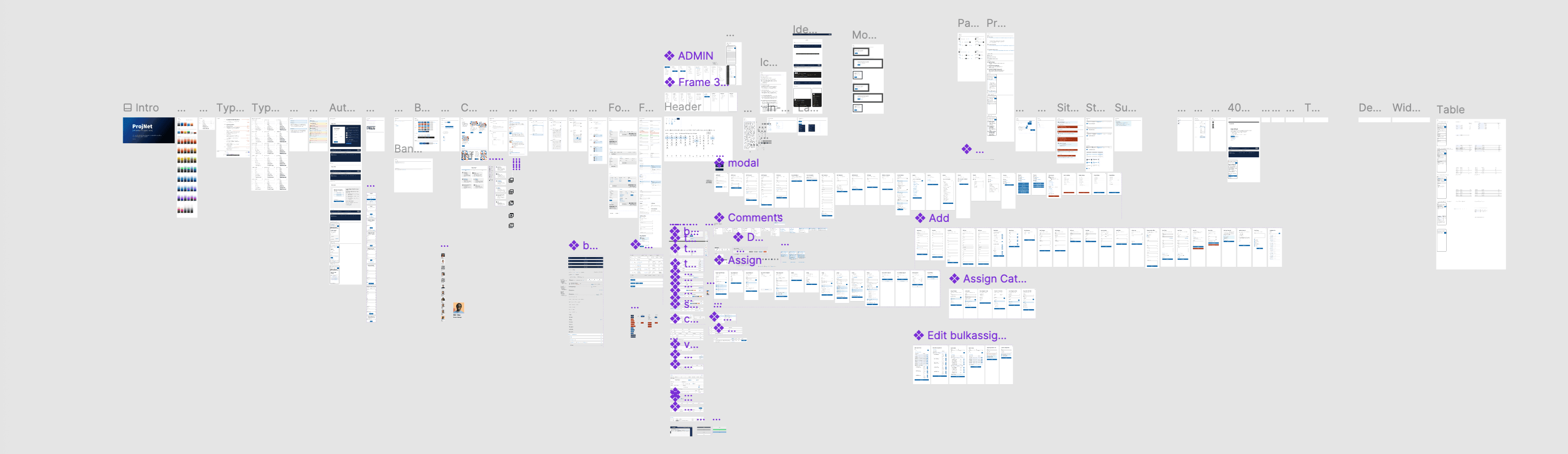
Key Insights
Users spent excessive time locating frequently used sub-applications
Critical workflows were buried under legacy navigation
Accessibility issues affected efficiency for assistive technology users
Redundant modules created confusion and technical debt
These findings shaped the foundation for redesigning the information architecture and prioritizing features that had the greatest impact on productivity.
The Design Iterations
Research insights informed the creation of a modernized structure that emphasized usability, clarity, and accessibility.
Information Architecture and Site Mapping
The full platform sitemap exposed duplicate features and underused modules. By restructuring the hierarchy, we simplified navigation and clarified relationships between tools. This blueprint became a shared artifact that guided development and design alignment.
Prototyping and User Workshops
Interactive prototypes were created in Figma and tested in hands-on workshops. Initially, users were skeptical about the redesign. However, as they explored prototypes and shared real frustrations, they became engaged contributors.
Participants surfaced critical usability gaps that had gone unnoticed and offered insights that directly shaped the interface design.
Accessibility and Visual Design
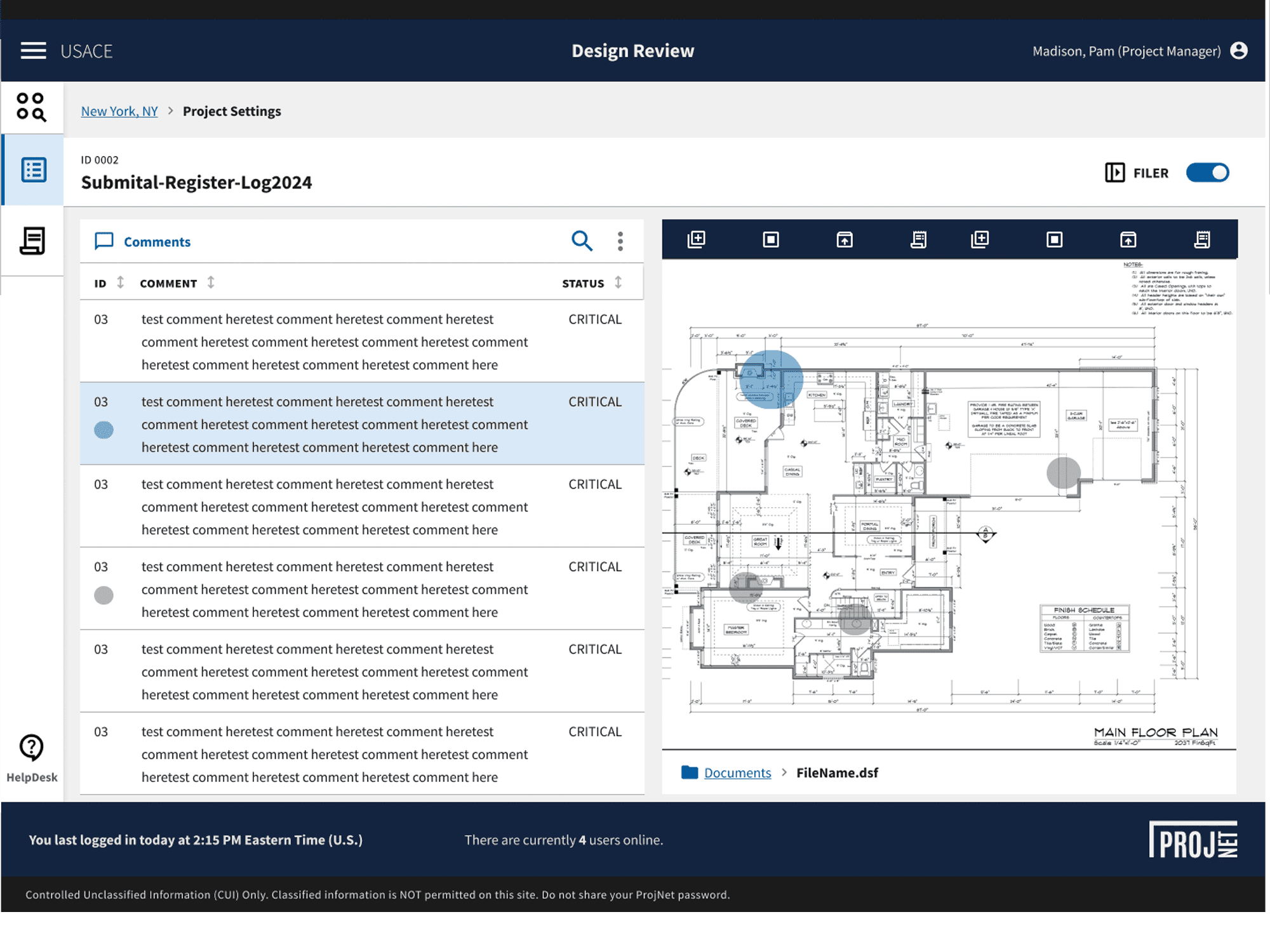
Adapting the U.S. Web Design System ensured compliance with Section 508 and WCAG standards. The design introduced clear typography, accessible color contrast, and component consistency that made navigation more intuitive for all users.
Usability Testing and Iteration
Each testing round informed design refinements. Internal teams validated component consistency, while external users confirmed improved workflow efficiency. The continuous iteration process maintained alignment with both user and business needs.
Results and Next Steps
Results
Reduced complexity by consolidating redundant workflows
Enhanced navigation clarity through a reorganized information architecture
Improved accessibility and consistency using USWDS standards
Strengthened collaboration between UX, product, and engineering through structured design reviews
Boosted user engagement and ownership through co-creation workshops
Visual Outcomes
Redesigned dashboard and key sub-application interfaces
Modular design system library supporting rapid updates
Scalable architecture ready for future enhancements
Next Steps
Extend the design system to additional modules
Conduct longitudinal usability studies to track post-launch performance
Integrate analytics for ongoing user behavior insights
Continue refining accessibility compliance as standards evolve
Conclusion
ProjNet's modernization was not simply a redesign, it was a transformation of how users, developers, and stakeholders interacted with the system. By focusing on research-driven insights, structured collaborations, and accessible design, we delivered a platform that is both functional and future-ready. This project reinforced the pwer of co-creation and the importance of giving users a voice in transforming the tools they depend on every day.